
🌸 Flori: A Flower Catalogue App 🌸


UX Research
UX/UI Design
Usability Testing
Prototyping
January 2023
The Challenge
Buying flowers online should feel as joyful as receiving them — but for many users, it’s stressful.
Busy young professionals want fast, affordable, and beautiful flower arrangements. However, most online flower ordering platforms feel cluttered, impersonal, and expensive — leading users to abandon orders or settle for uninspiring designs.
✿ The Result ✿
Flori is a playful, modern flower catalogue app that makes it easy for users to browse, customize, and order contemporary flower arrangements — balancing simplicity with creativity across every screen.
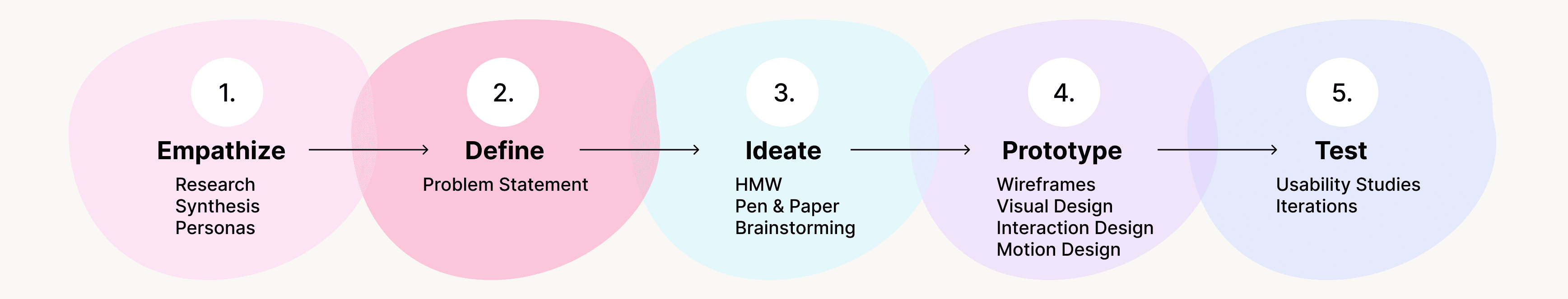
✿ Empathize ✿
Research Approach
I surveyed 15 participants aged 22–40 to understand how people currently shop for flowers and what frustrations they experience online.
Key Research Questions
How do users prefer to purchase flowers?
What stops users from ordering flowers online?
What factors influence their decisions most?
Key Findings
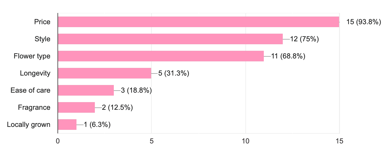
Price, style, and flower type are the top priorities.
35% prefer buying flowers in person for better quality control.
Major pain points:
Lack of trust in online images
High or hidden costs
Overwhelming, cluttered websites
Limited personalization options
To my surprise, more users (35%) prefer to buy flowers in person at a local flower shop and at the grocery store (28%) than online (25%), with few preferring to purchase flowers by telephone and at a local farmers market. When asked why, users provided a number of different responses:

As identified, price is a large constraint in a user’s decision to order flowers online. In addition, 27% of users expressed concerns about visual representation. Users are hesitant to order flowers online because they cannot see what the flowers will look like in person. Additional comments about flowers catalogue websites included: “they’re not user-friendly,” “they’re expensive and tacky-looking,” “they lack personalization” and “the websites can be overwhelming.”
On the other hand, those who do prefer to purchase flowers online rather than in person identified convenience as the most important factor that influences their decision. These users prefer to save time picking our arrangements in person, especially when sending flowers to someone who does not live close to them.
33%
Are concerned about price
27%
Want to see them in person
13%
Need the flower quick
✿ Define ✿
Personas
After collecting and analyzing the data found through foundational research, I began developing personas to identify target user groups and their needs.

Adeline | 35 | Director of Marketing
Adeline is a busy working professional who works from home. Adeline likes to buy flowers for herself to make her office more enjoyable. Adeline would prefer to order flowers online to save her valuable time but is concerned about the quality of the arrangements.
“I wish flower delivery apps were more consistent. I want to know exactly what I am getting.”

Ben | 22 | Student
Ben is a student who commutes to school from his father’s house. Ben wants to send flowers to his mother, who lives in New York, for her birthday and other occasions. He finds it difficult to find personalized flower arrangements that remain within his budget.
“I love sending my mom flowers on special occasions as a reminder of my appreciation for her. I wish I could do it more but it’s hard to find an app within my budget.”
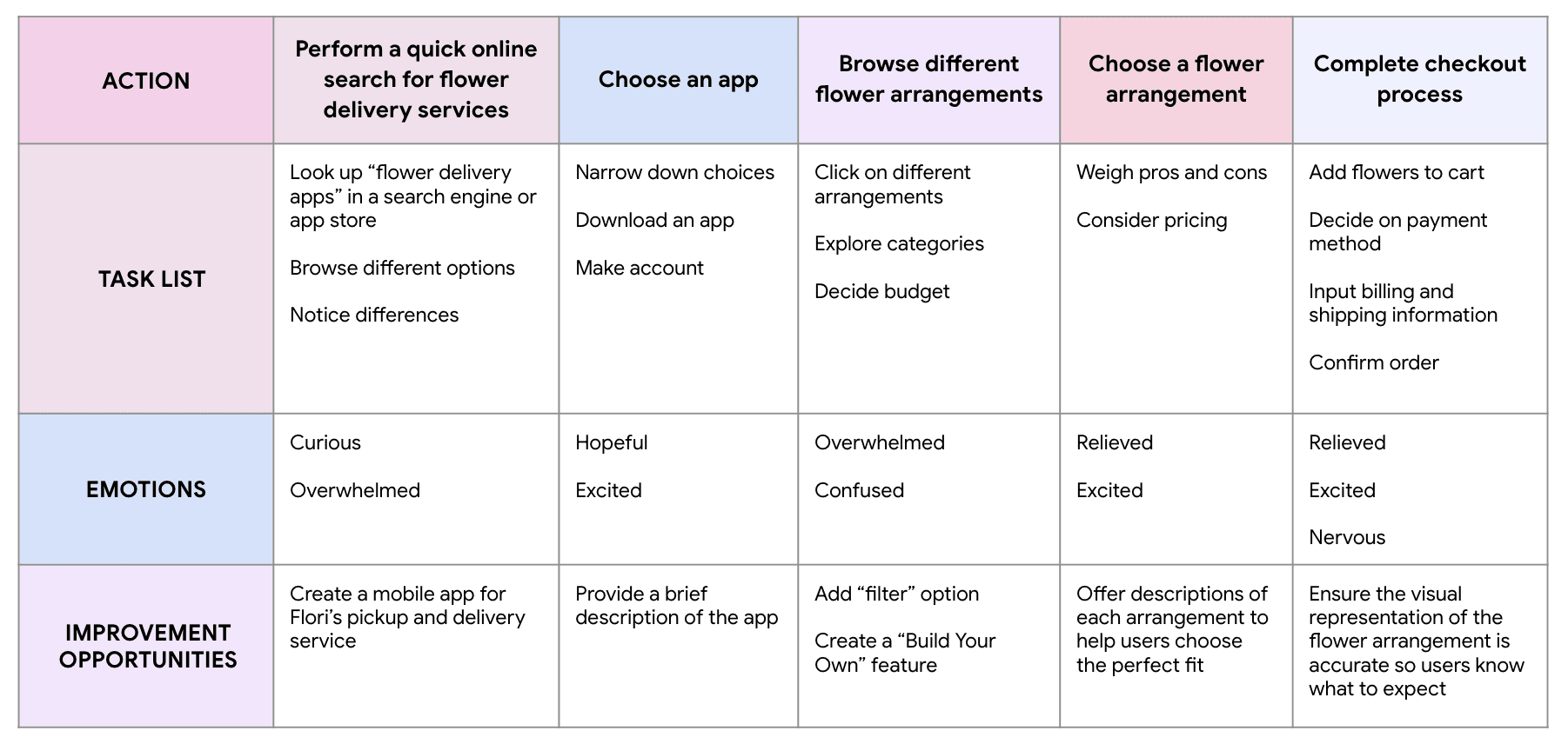
User Journey Map
Key Findings
Research helped identify various factors that contribute to users’ decisions to purchase flowers online in addition to a number of pain points that user face while interacting with flower catalogue apps and website.
Time: Young professionals are busy and would prefer to save time physically visiting a flower shop and picking out an arrangement.
Money: Users would like to utilize the convenience of purchasing flowers online but are concerned about the cost.
Personalization: Users want the option to personalize flower arrangements according to their preference and be given a visual representation of what to expect.
Information Architecture: Text-heavy and image-crowded apps and websites make it difficult for users to navigate and choose an arrangement.
Accessibility: Platforms for ordering flower arrangements are often not equipped with assistive technologies.
✿ Ideate ✿
How Might We:
Provide better visual previews of arrangements?
Allow customizable flower selections?
Be upfront about pricing throughout the process?
Keep the interface clean while offering enough options?
Ensure accessibility is baked into the design?
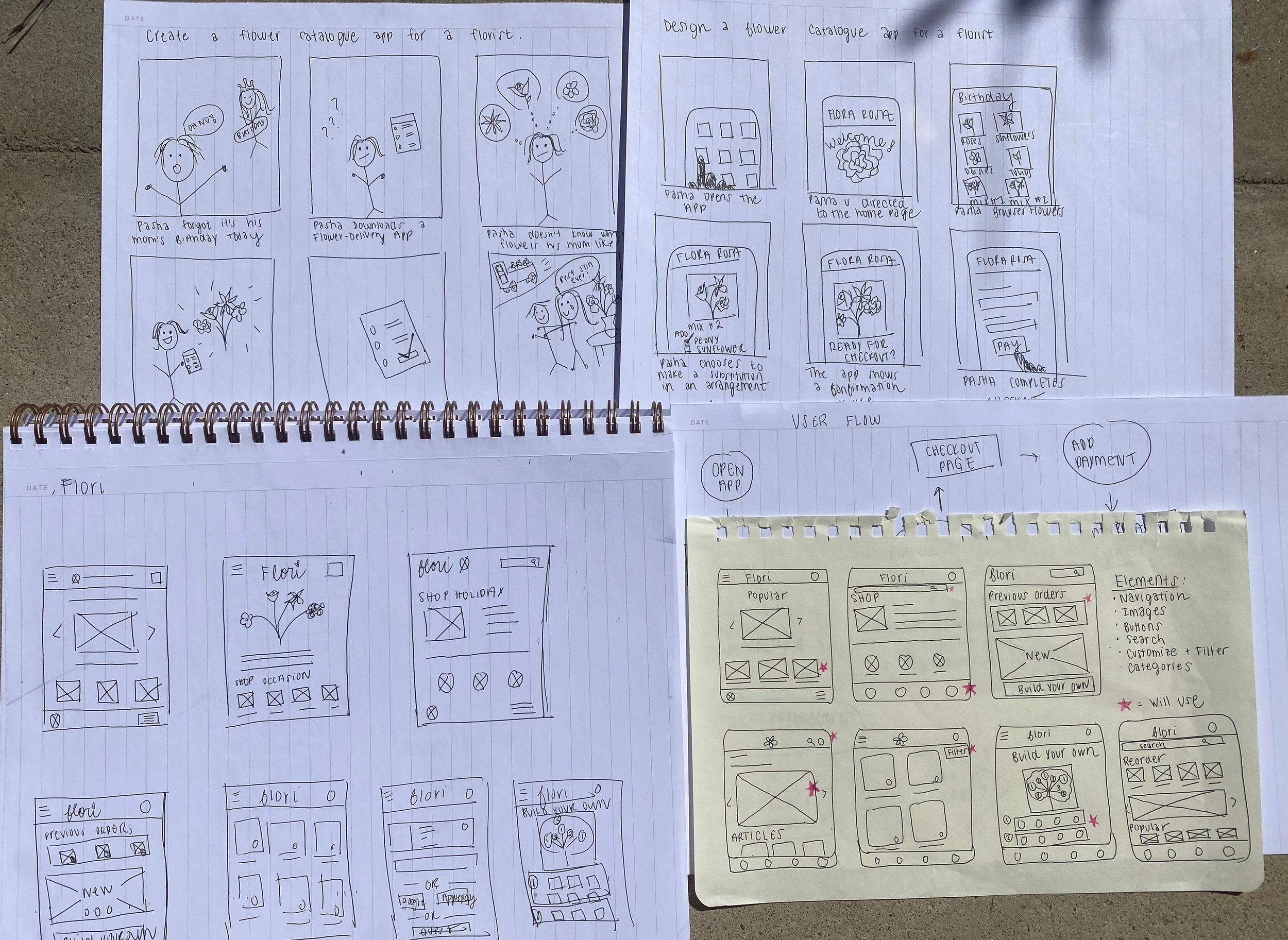
Sketching:
I began sketching ideas on pen and paper for the user flow and design of Flori’s flower catalogue app. I first outlined user flows. Next, I create big-picture and close-up storyboards to connect insights uncovered during research with the user flow experience. Lastly, I began drafting wireframes. I created a list of elements to include on the homepage and combined the most important elements into one page that would minimize the amount of time it takes users to choose and purchase flower arrangements.
✿ Design ✿
Sketches & Wireframes
I sketched key flows: selecting a bouquet, customizing arrangements, and a streamlined checkout process. I focused on:
Fast browsing
Personalization without complexity
Price visibility
Lo-Fi Prototype
I then built a clickable prototype prioritizing:
Filtering by price, style, and flower type
Clear checkout path
Option to "Build Your Own Bouquet" with live price updates

✿ Test ✿
Usability Study
Two rounds of unmoderated usability studies (KPIs: task success rate, time on task, user satisfaction).
Round 1 Insights:
Pickup & delivery options needed
“Reorder” button unnecessary
Custom bouquet building flow needed clearer instructions
✿ Mockups ✿
I iterated on my initial low-fidelity wireframes based on feedback from the first usability study. I added visual design to the wireframes and kept in mind Gestalt Principles to create my first round of mockups. I reflected on my progress before creating a high-fidelity prototype.
Iterations
Added both pickup and delivery
Removed "reorder" button
Clarified bouquet customization steps

✿ High-Fidelity Prototype ✿
In this phase, my emphasis was put on visual consistency, navigation, and interactions. I added interaction details and animation to serve the core user flow:
1) Exploring Categories
2) Browsing and Filtering Results
3) Customizing Arrangements
Open App & Explore Categories
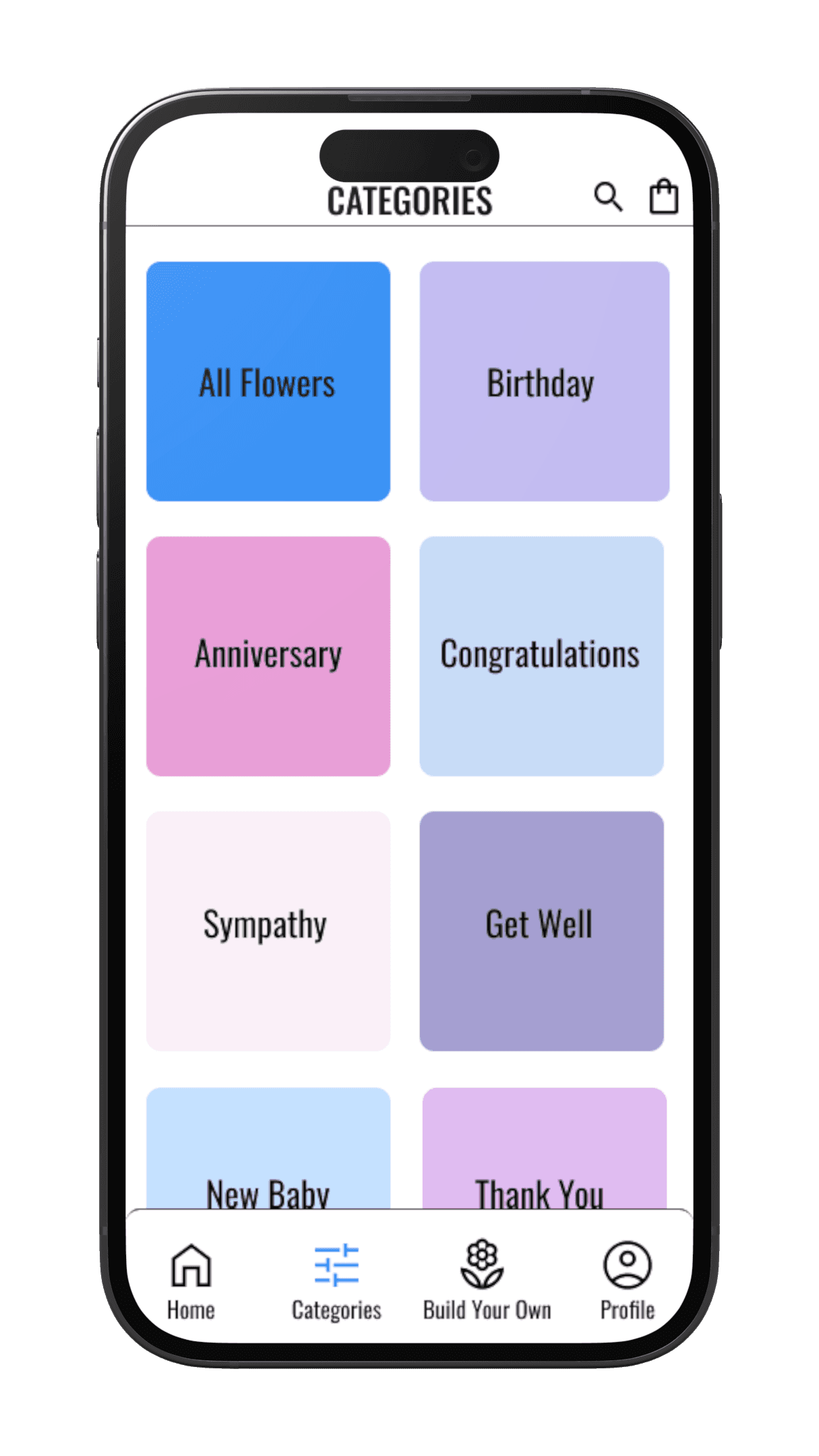
From the home page, there are multiple ways to view flower arrangements. There is a “shop now” button on the home screen, a preview of popular arrangements that can be clicked on, and a “categories” button on the main navigation bar. Providing multiple options allows users to quickly and easily browse arrangements for efficient shopping.
Browse Arrangements & Filter Results
After selecting a category, there is the option to filter results. Users can filter arrangements by price, style, flower type, and occasion. Filtering helps maintain a clean interface while providing a large amount of options to cater to all user needs. Users can narrow down results based on personal preference, which speeds up the process of choosing an arrangement.


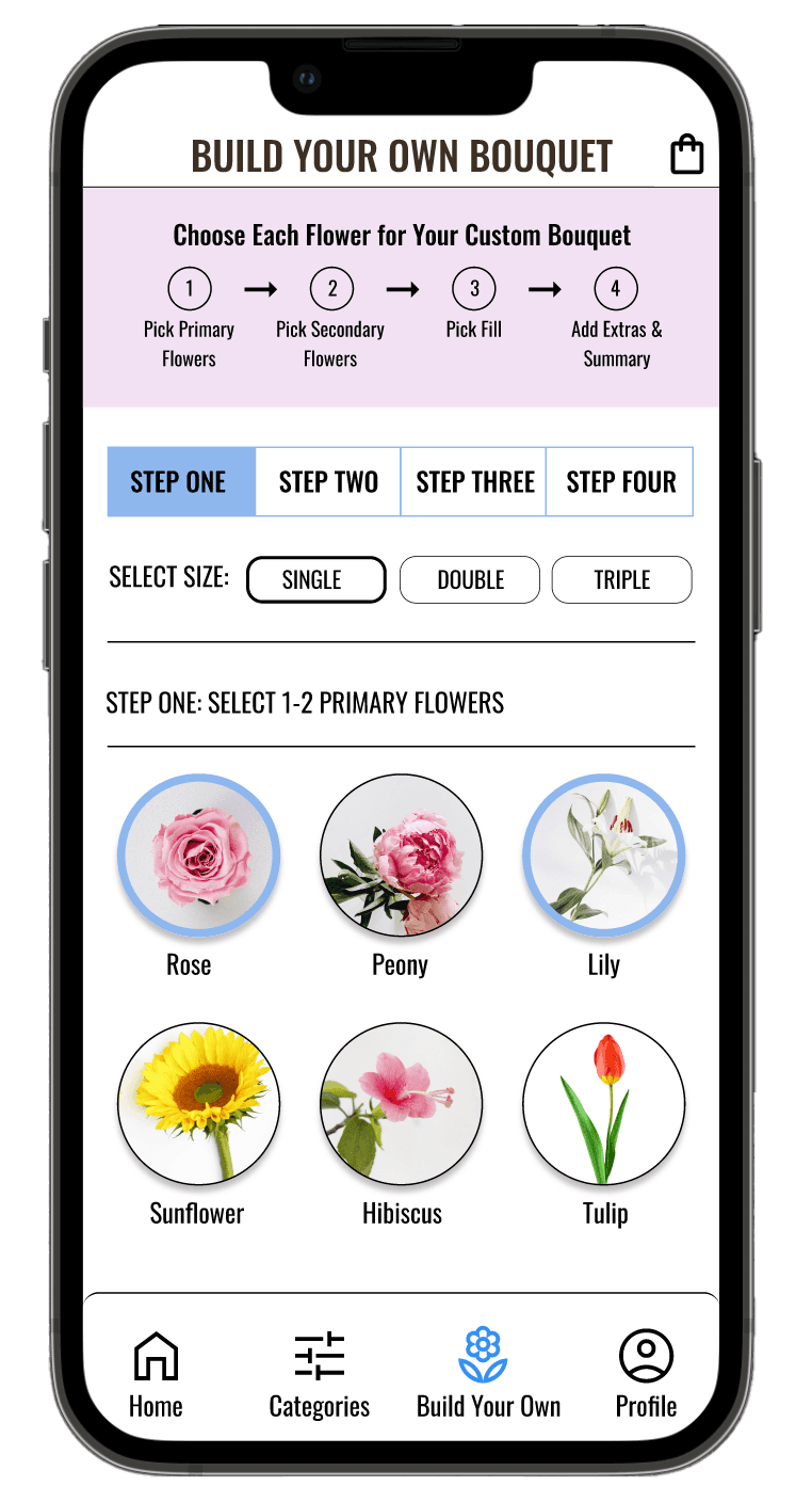
Build Your Own Bouquet
If users want to create a more personal arrangement, they can navigate to the “Build Your Own Bouquet” page. Users can choose as many primary flowers, secondary flowers, filler flowers, and add-ons as they please. The price updates as users add and subtract flowers. Customizing allows users to have complete control over the size of the arrangement, the types of flowers included, and the price. It is a great option for those who know exactly what they want and/or are on a budget.
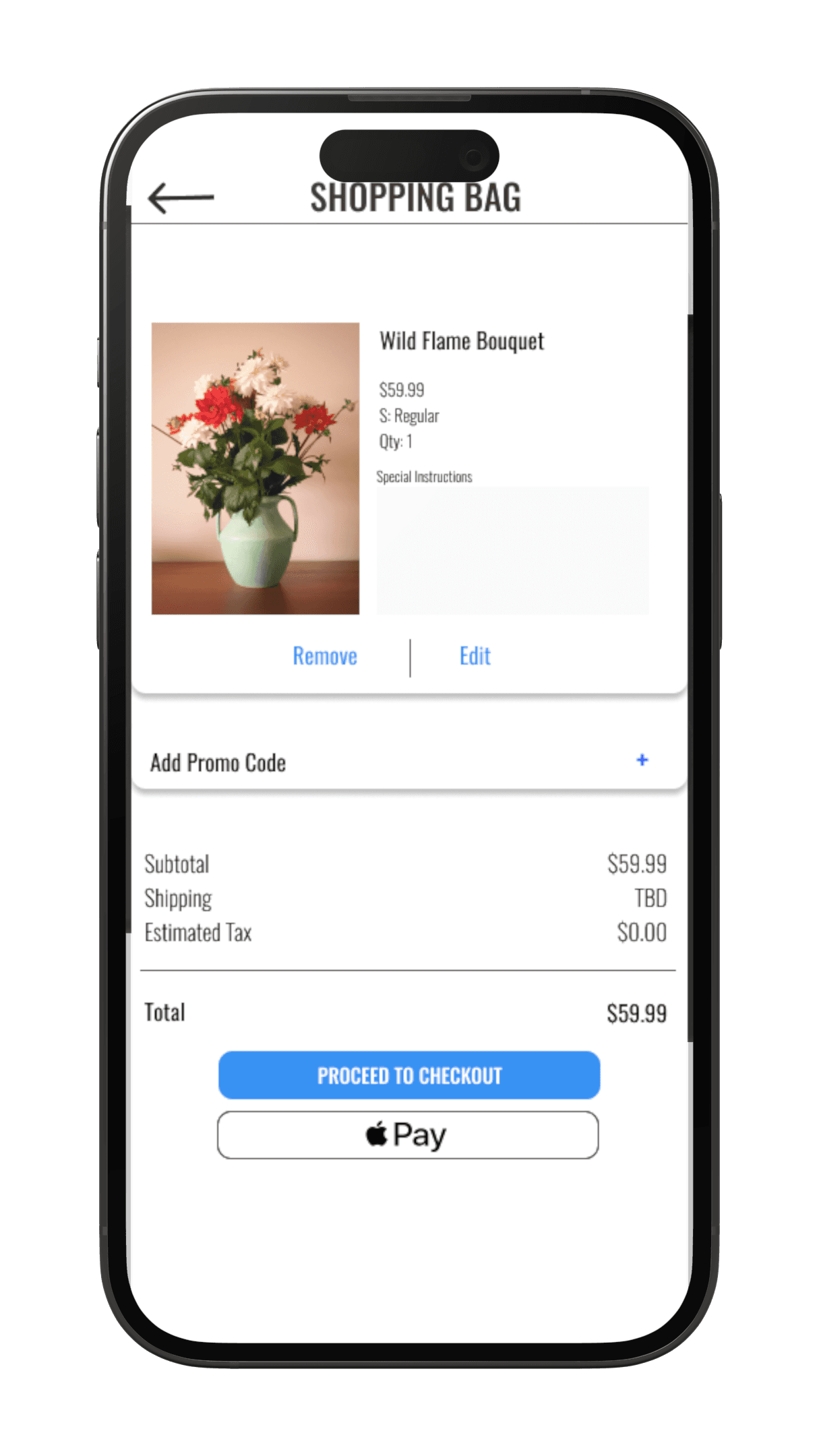
Add to Bag & Checkout
Once users choose a flower arrangement, they can easily add it to their bag with a click of a button. The bag icon updates with a notification next to it. Users are prompted to click on the bag, proceed to checkout, enter personal and payment details, choose pick-up or delivery, and place the order. A confirmation page is displayed with order details after the checkout process is completed.
✿ Evaluation ✿
Round 2 Feedback
Users were able to complete the main user flow with minimal issues.
Users felt the checkout process was simple and efficient.
Users especially liked the “Build Your Own Bouquet” feature, as they found it unique and interesting.
Users found the filter button useful and could see themselves utilizing this feature in real life.
Before
After


In the initial prototype, users were prompted to select an arrangement size. After analyzing user feedback, I decided to add an information button next to "Select Size.” Users can hover over the information button, which triggers a pop-out window that explains the number of flowers included in each size. In addition, I added an information button next to each flower type. When selected, a brief description of the flower’s general appearance, scent, and estimated longevity is revealed.
✿ Design ✿
When deciding the overall design of the app, I kept in mind my target audience and main challenges. I decided to keep the design simple, calm and delicate. I used mainly white and black to maintain a clean interface. I added light pinks and blues as accent colors to compliment the colors of the flower arrangements without overshadowing them.

✿ Accessibility Considerations ✿
I revisited the Web Content Accessibility Guidelines throughout my design process to ensure my design decisions adhered to accessibility standards. I made a few small adjustments to my prototypes that could make a large difference to some users.
Added alt text to images for screen readers for those with visual impairments.
Used color contrast ratios with surrounding text that follow the Web Content Accessibility Guidelines.
Used icons and imagery to help users navigate the app more easily.
✿ Reflection ✿
As Flori was the first case study project I worked on, I learned many important lessons. I learned the importance of following a user-centered framework. Following this design process continued to remind me to keep my users front and center and make design decisions based on research. I also learned the importance of planning. While I wanted to jump right into the design, planning allowed me to stay organized and focus on the main challenge. Creating a detailed research plan before conducting usability studies was very beneficial, as it ensured that I would receive valuable feedback to consider in my iterations. I am excited to learn more and revisit this project in the future.
Takeaways
Conduct another usability study to identify additional pain points that users might face when using the app.
Review accessibility standards and brainstorm more ways to ensure the app is accessible to all users.
Conduct more research on competitors to determine how to offer new and unique features.
Future Steps
Conduct another usability study to identify additional pain points that users might face when using the app.
Review accessibility standards and brainstorm more ways to ensure the app is accessible to all users.
Conduct more research on competitors to determine how to offer new and unique features.
✿ ✿ ✿
See more work

Michellada - Merchandise Customization App & Website

Whale Friend - Beach Cleanup App & Website